Love the Cook
✦ Overview
Love the Cook had a growing collection of house brands, each with its own audience, personality, and product story. My role was to build distinctive identities across coffee, preserves, candles, tea, and seasonal collections while creating enough cohesion for them to feel connected to the same retail world. Rather than forcing everything into one visual system, I focused on finding the character of each product and tying the larger portfolio together through a shared sense of place, craft, and care for the home.
✦ Skills
Brand Strategy, Art Direction, Packaging Systems, Visual Identity
✦ Key Partners
Owner, Product Development + Production Partners
✦ Industry
Consumer Goods + Specialty Retail
Challenge
Love the Cook was growing a collection of house brands across very different product categories, each with its own audience, tone, and packaging needs. The challenge was to give every line a distinct point of view while still making the broader assortment feel intentional, cohesive, and connected to the larger retail brand.
Focus
Build flexible brand systems around the character of each product, then connect them through shared principles of craft, warmth, place, and home. The work needed enough structure to scale across packaging, seasonal launches, and new product extensions without flattening the personality that made each line unique.

One retail world, many distinct brands
-
Love the Cook’s house brands needed to feel distinct without becoming disconnected. Each product line was given its own identity, tone, and visual language, while shared ideas around craft, warmth, place, and home kept the portfolio connected.
-
Each line was built around the role it played in everyday life. Coffee, preserves, tea, candles, and seasonal collections were positioned through ritual, flavor, memory, and place, giving each product a clear point of view beyond the category itself.
-
Typography, illustration, color, photography, and packaging structure shifted across product lines to create individuality while maintaining a consistent level of craft. The result was a flexible retail system that could support new products and seasonal launches without losing personality.

Morning rituals with
Cape May Roasters
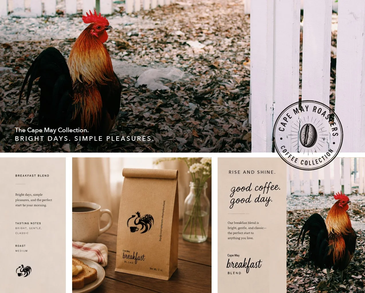
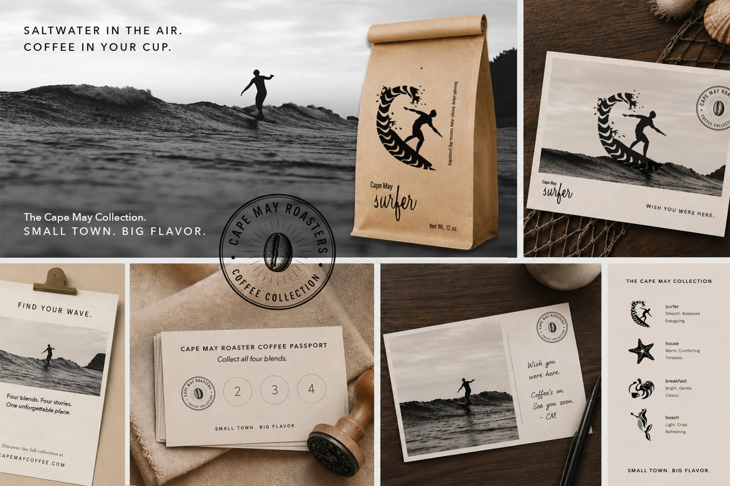
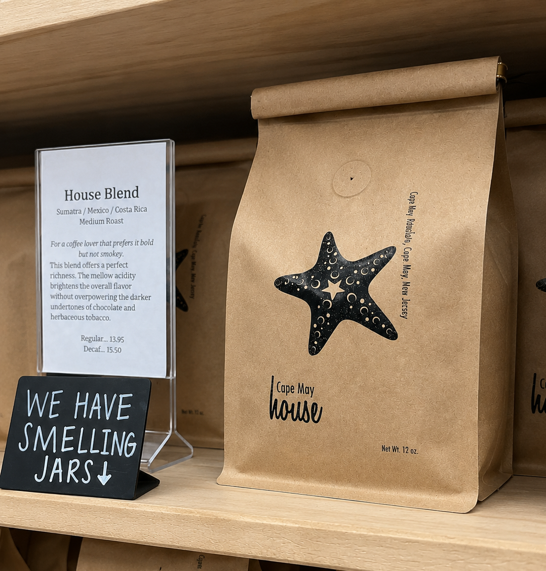
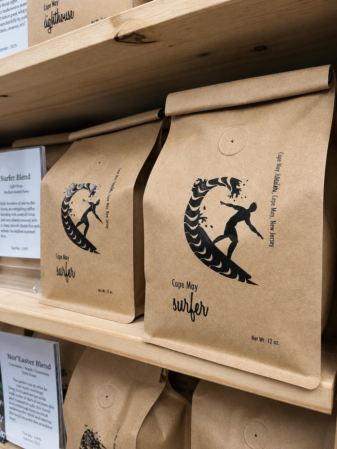
Cape May Roasters was built around the familiarity of a daily ritual and the easy rhythm of coastal mornings. The identity paired nostalgic cues with a cleaner, more contemporary system, creating a coffee brand that felt warm, local, and grounded without becoming overly rustic.
"Since the redesign we have seen a significant increase in product sales."
✦
"Since the redesign we have seen a significant increase in product sales." ✦
The visual language extended across packaging and supporting materials with a focus on simplicity, place, and everyday use, giving the line enough personality to stand on its own while still fitting naturally within the larger Love the Cook collection.


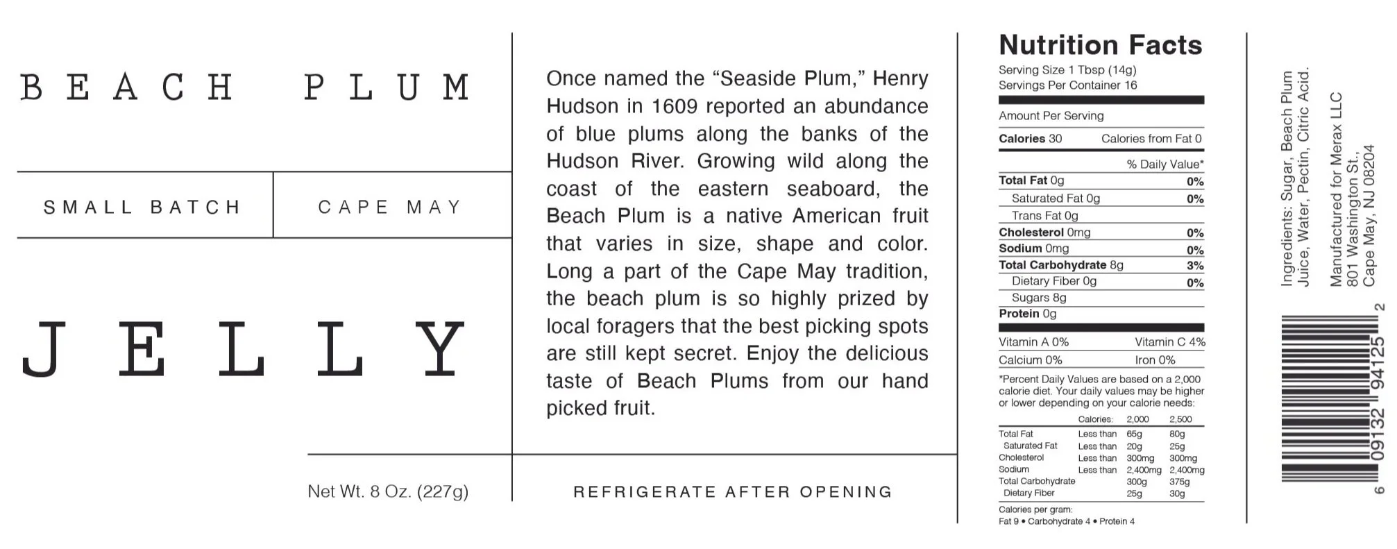
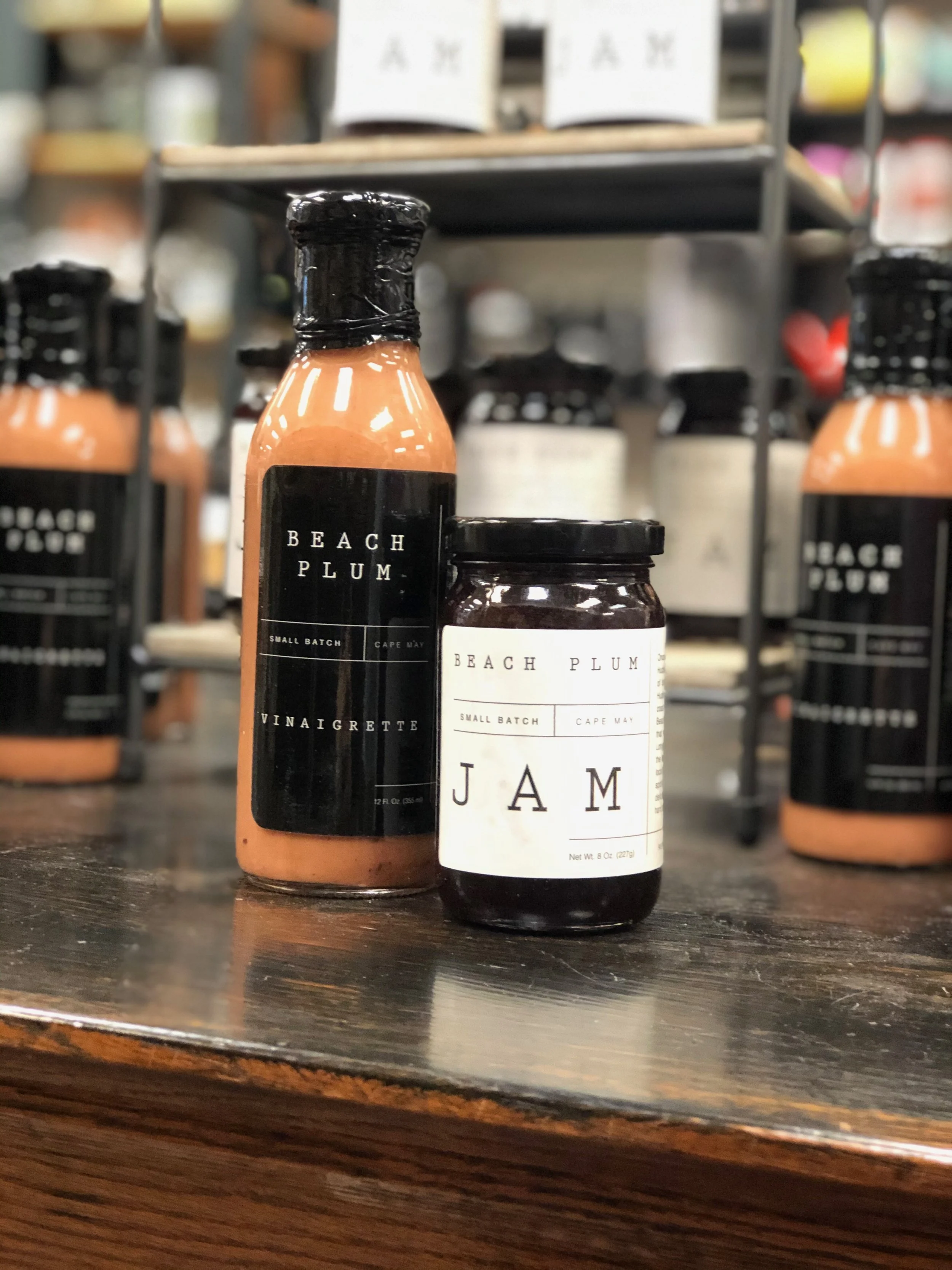
Seasonal character with the Beach Plum collection
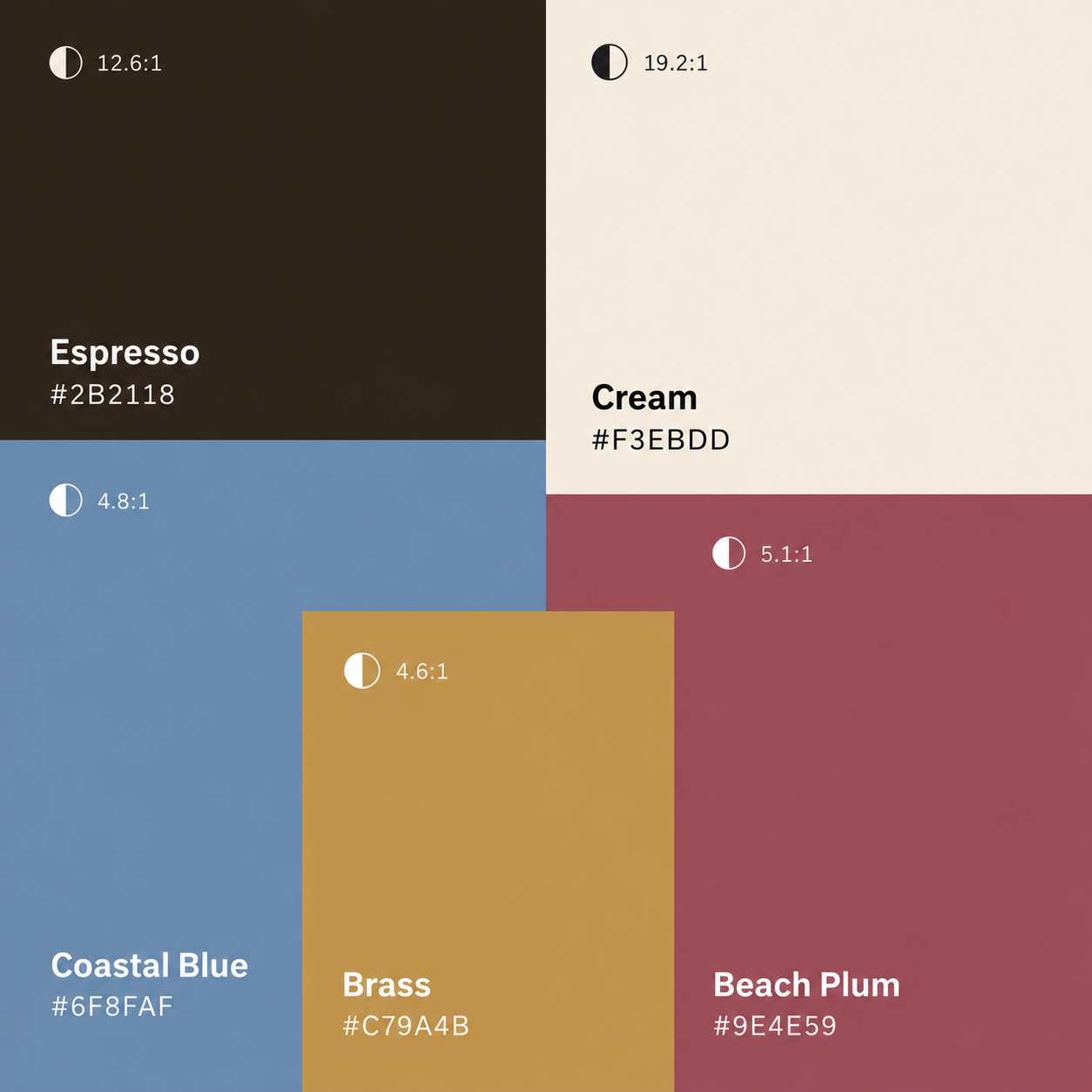
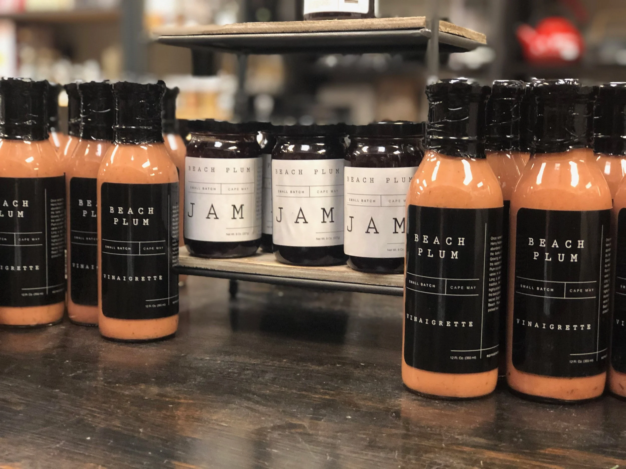
Beach plums have a short season and a strong sense of place, so the collection was built around that feeling of something local, limited, and worth waiting for. Produced in small batches, the line celebrated the harvest through a visual system that felt bold, simple, and distinctly coastal.
The packaging used strong contrast and restrained typography to give the products shelf presence without losing the handmade quality behind them. The result was a seasonal collection that felt special without becoming precious.

The scent of Cape May
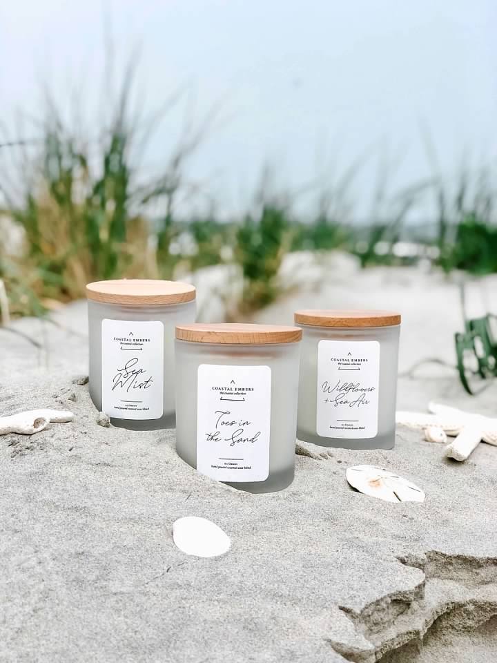
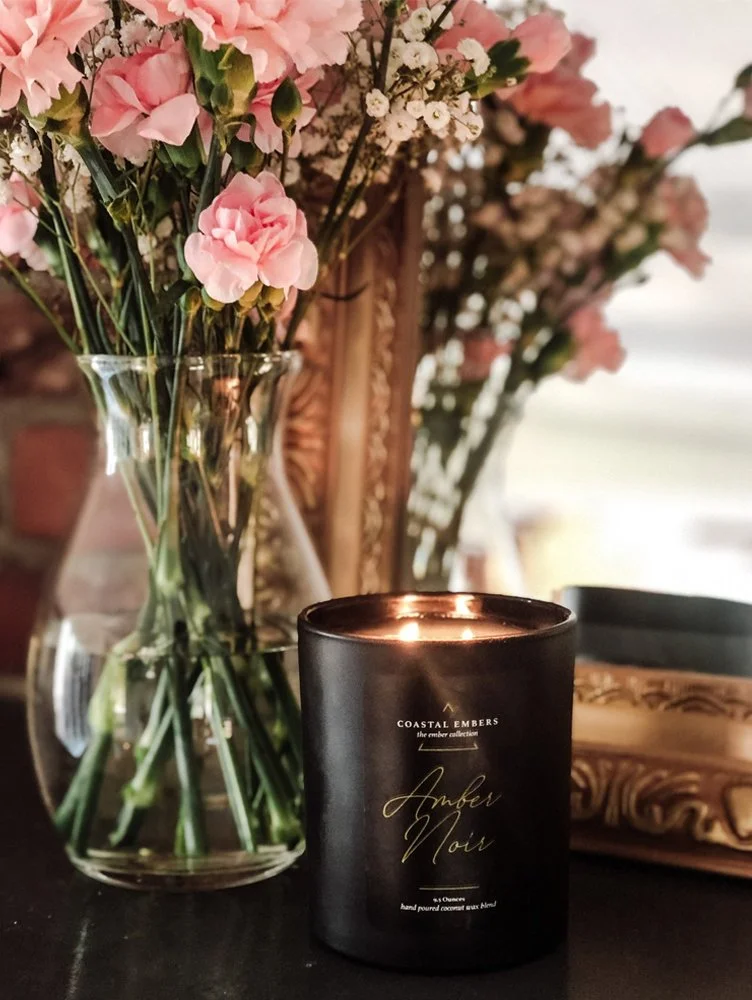
with Coastal Embers
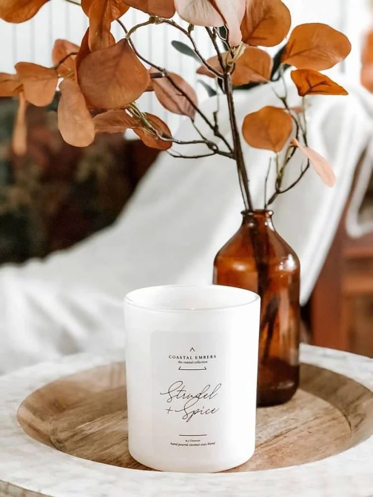
Coastal Embers was built around the feeling of bringing Cape May home. The candle line translated familiar coastal moments into scent, pairing clean, modern packaging with fragrances inspired by salt air, sun-warmed wood, and evenings by the shore.
The identity was intentionally restrained, letting the atmosphere and sense of place do the storytelling while creating a product that felt elevated enough to live comfortably in the home.


The tea collection was built around the quieter side of coastal living: slow mornings, afternoon breaks, and the simple ritual of making something warm. The identity balanced natural cues with clean, modern packaging, creating a line that felt calm, approachable, and elevated without losing the sense of comfort at its center.
A slower ritual,
steeped in the coast
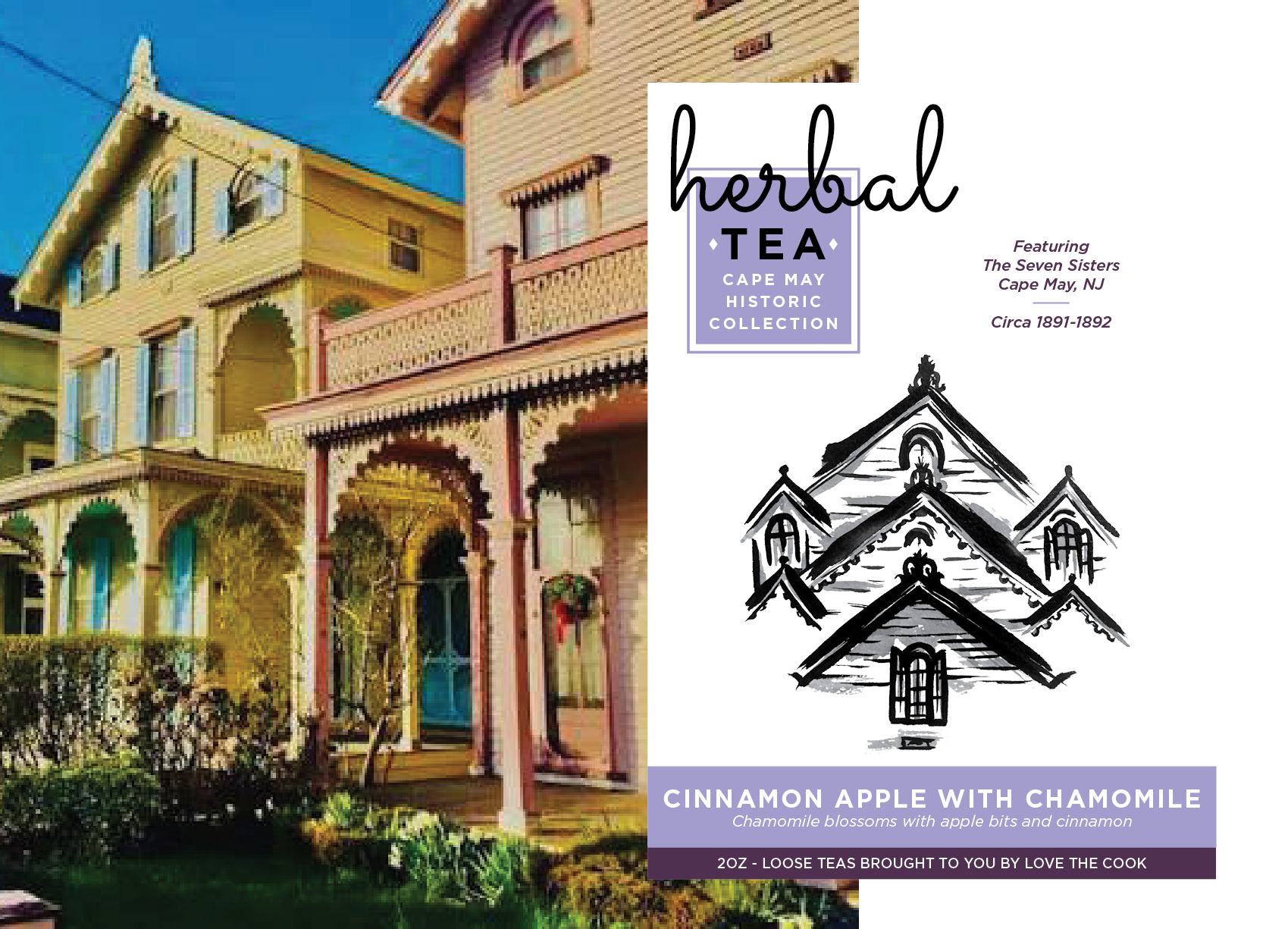
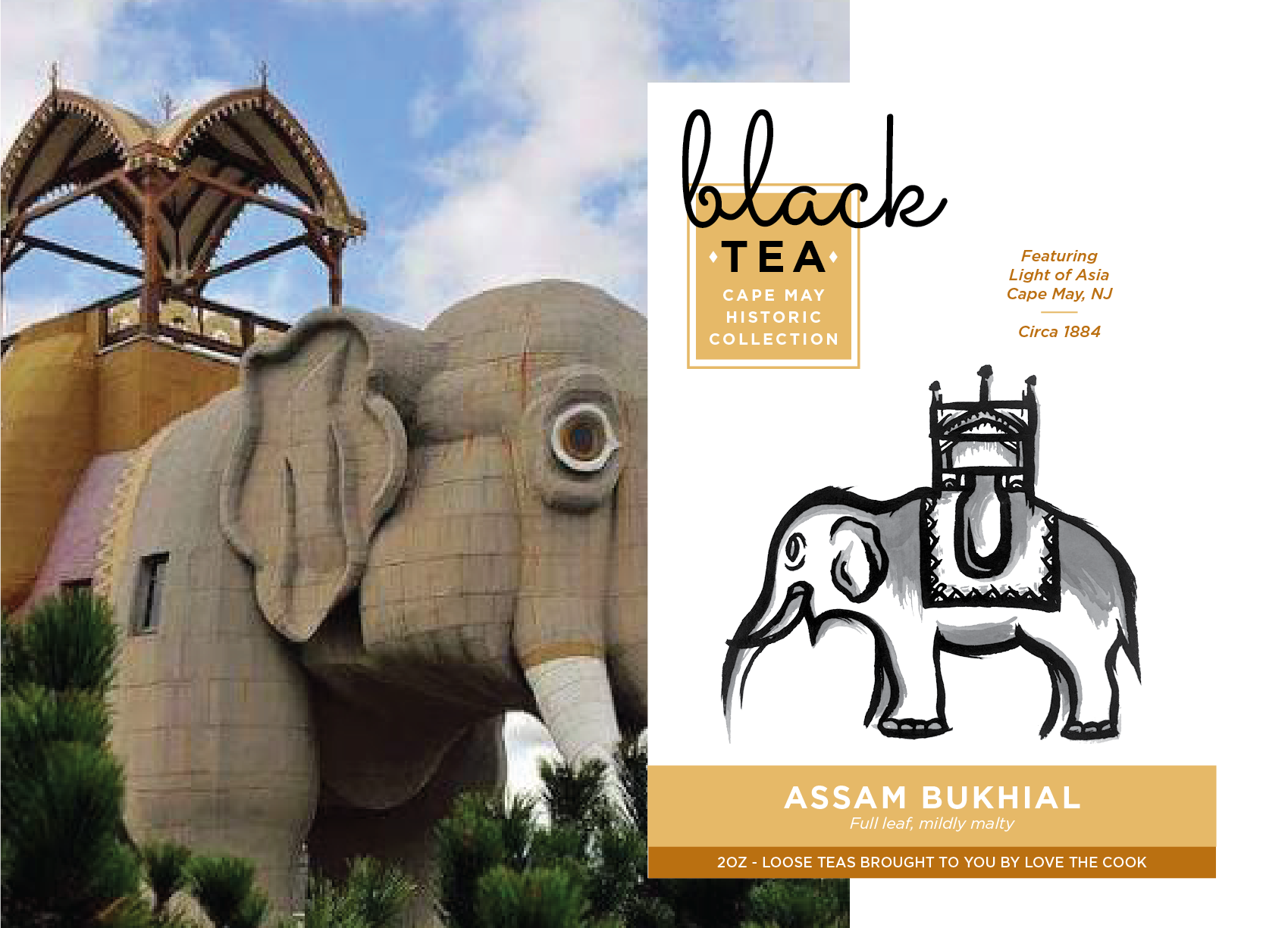
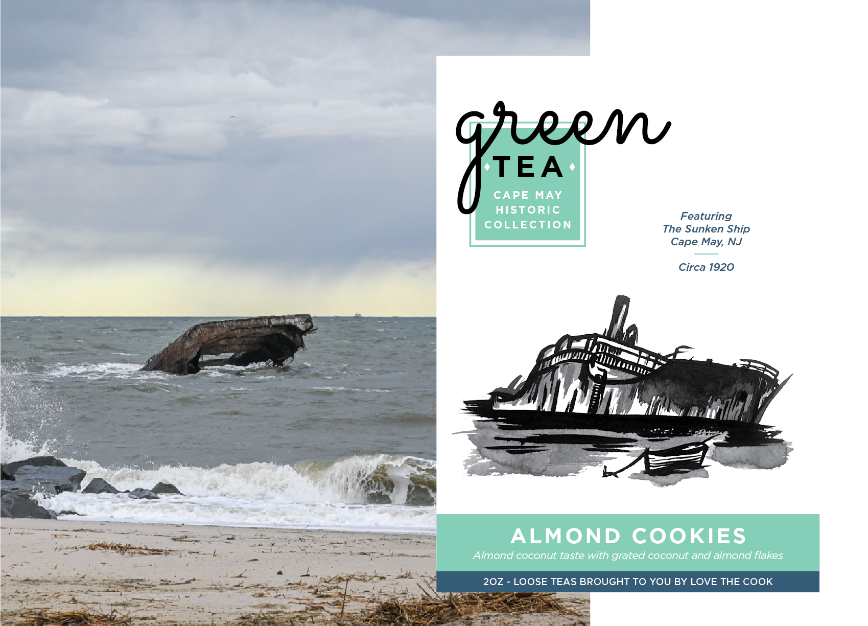
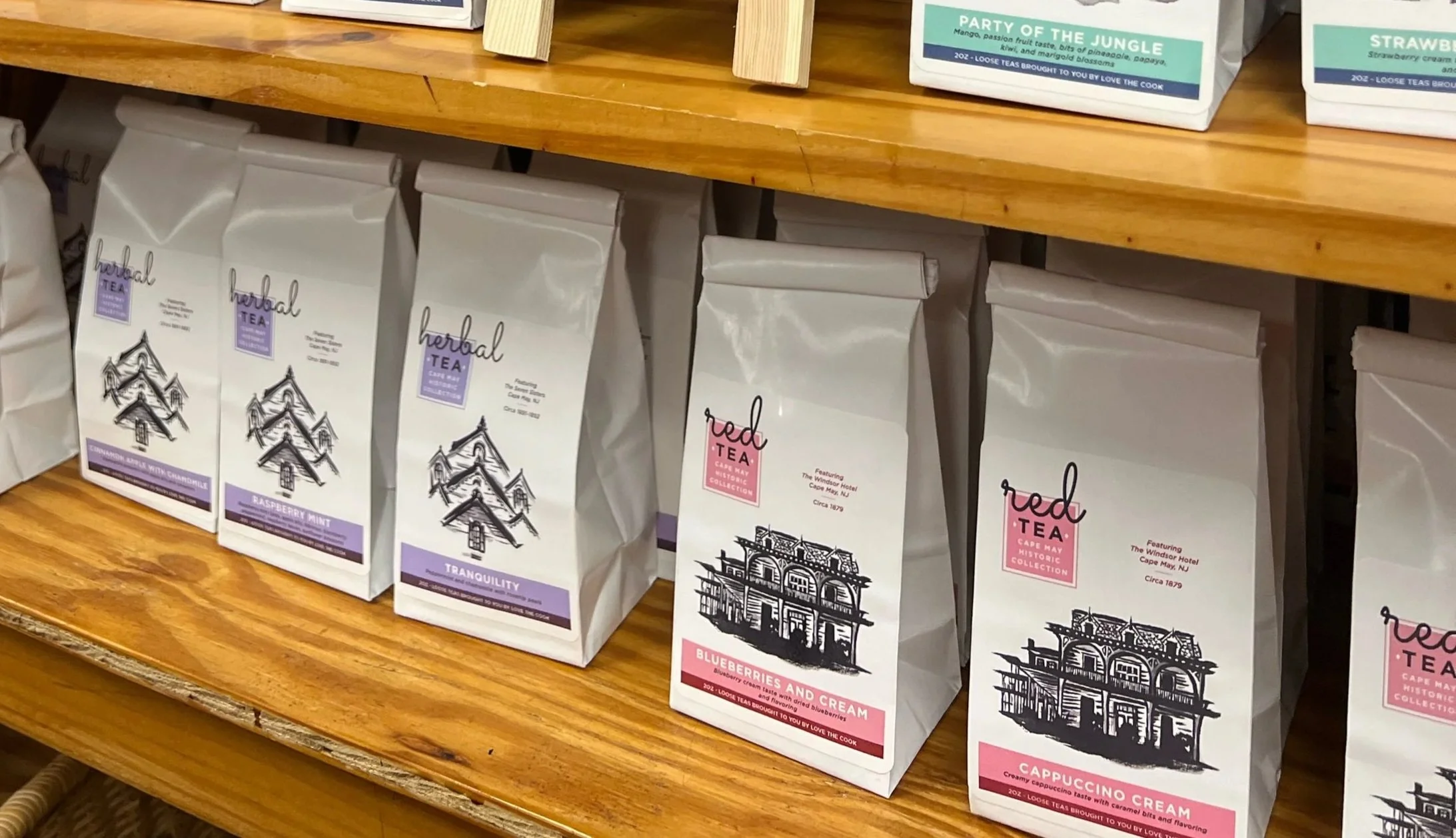

What began as a collection of products became a broader brand world built around ritual, place, and the feeling of home. The strongest part of the work was giving each line its own personality while keeping the larger experience connected, creating a portfolio that felt varied, thoughtful, and unmistakably rooted in Cape May.
Stephanie has become a key player in developing our brands. She has created a collection of packaging that allows each product to stand out individually while fitting into a cohesive collection. She has a special ability to infuse personality and characteristics you want to define your brand.”
— Christine Cassidy, Product Manager, Love the Cook
“We've seen a significant increase in sales and an overwhelmingly positive response from our existing customers.
Keep exploring
-
![]()
Cipher 10 Jeans
-
![]()
Campus Philly
-
![Dental professionals]()
Spear Education
-
![Miami City Ballet dancers]()
Miami City Ballet