Spear Education
✦ Overview
When I joined Spear Education, the company had a strong reputation and a growing family of products. The pieces were there, but they weren’t working together. My focus was to bring everything under one cohesive brand system. Through clear standards, collaborative leadership, and consistent creative oversight, we built a connected and contemporary brand resulting in a brand that felt current to its audience while remaining unmistakably Spear.
✦ Skills
Art Direction, Brand Architecture, Visual Identity Systems
✦ Key Partners
Creative, marketing, UX, and clinical experts
✦ Industry
B2B Continuing Dental Education
Challenge
An evolving product ecosystem made it difficult for audiences to understand how offerings connected to one another and to the larger brand.
Internal language did not always translate to the outside world, creating a gap between Spear’s expertise and how its value was communicated.
A strong legacy and changing organizational priorities made it difficult to establish a consistent visual identity that could evolve without losing recognition.
Focus
Clarify the relationship between Spear’s growing product suite and the larger brand.
Turn complex clinical and educational ideas into clear, compelling communication for a sophisticated audience.
Build a flexible visual system that could support change while keeping every experience recognizably Spear.

Connecting the brand from the inside out
-
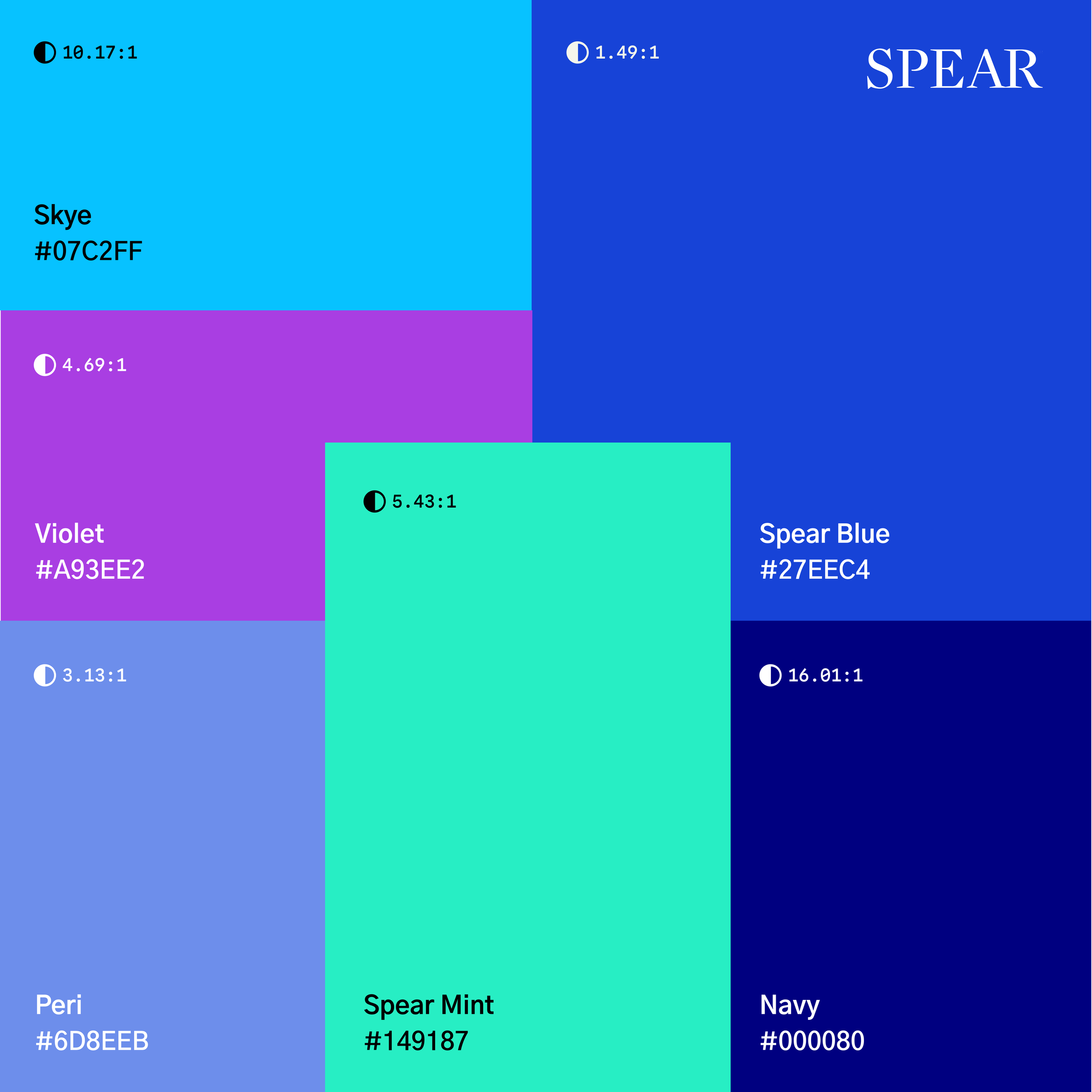
Connected Spear’s evolving products through a flexible master-brand system, making each offering easier to understand while strengthening recognition of the larger brand.
-
Translated complex clinical and educational ideas into clear, compelling communication that showed how Spear helps dental professionals turn knowledge into better care.
-
Centered the brand on people, progress, and shared excellence. Authentic imagery, purposeful storytelling, and a more contemporary visual system balanced clinical authority with warmth and human connection.

Turning uncertainty into a reason to begin
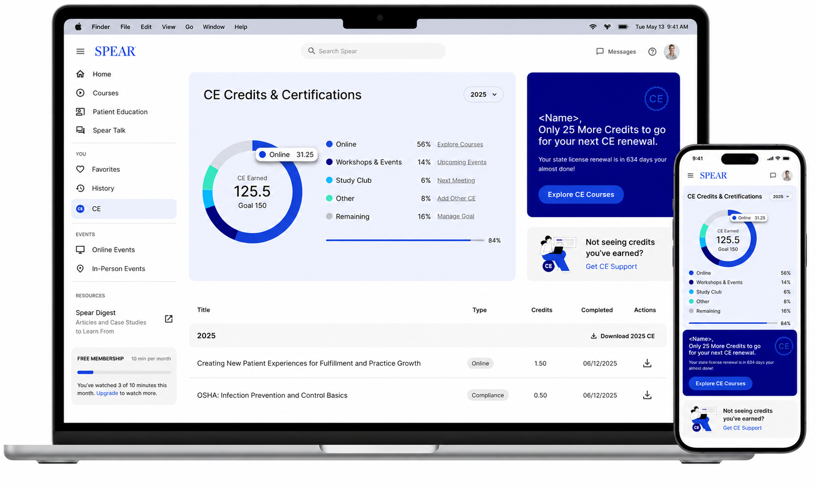
Working alongside Product and UX, I helped bring the evolved Spear brand into a platform that had remained largely untouched through years of broader visual updates. UX led the experience and interface structure; my role was to connect the platform back to the larger brand system so it finally felt aligned with the Spear customers were seeing everywhere else.
Start with what you don’t know
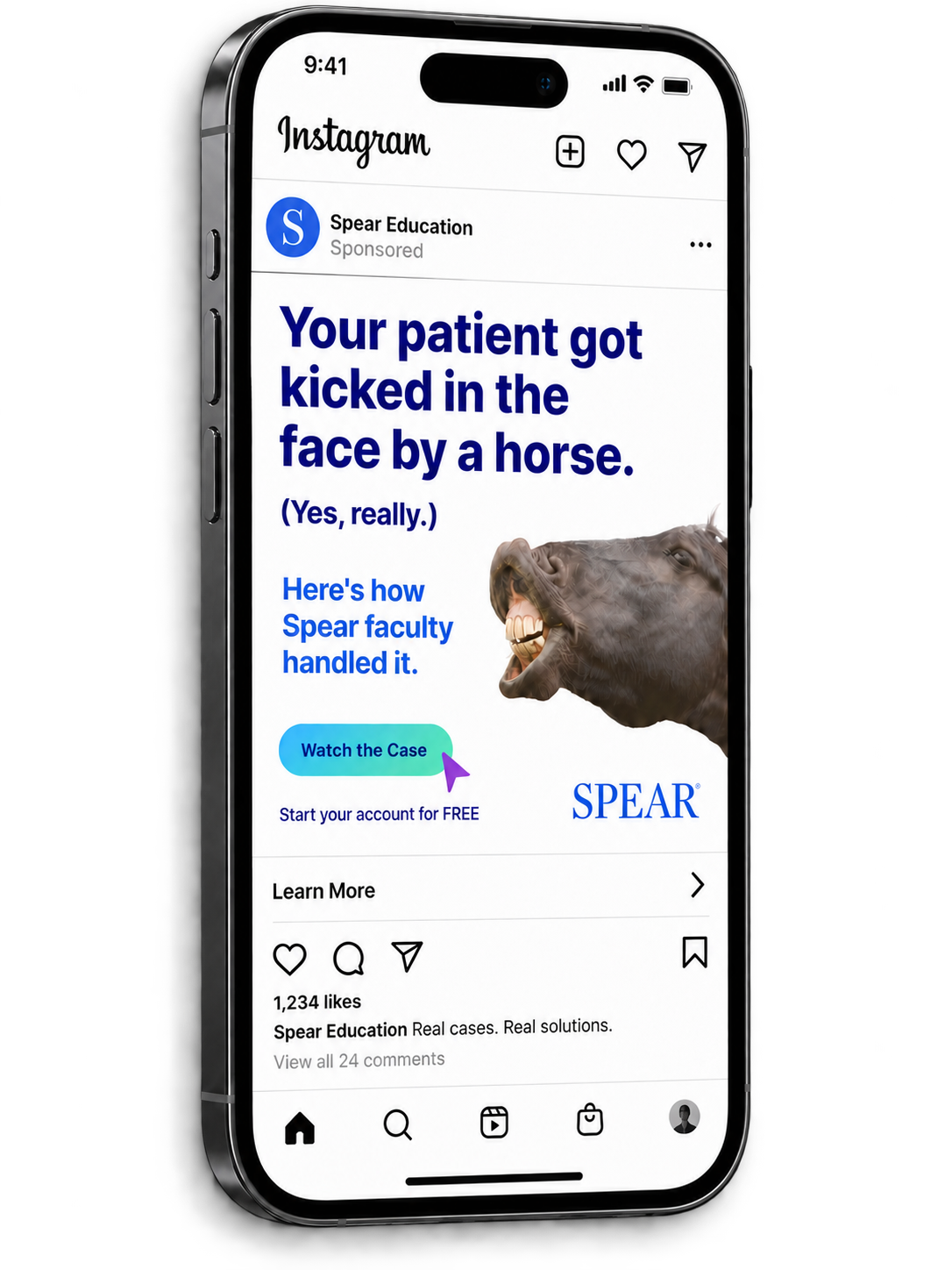
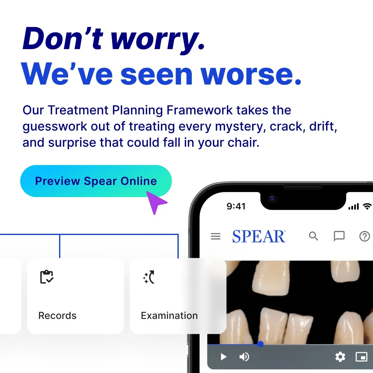
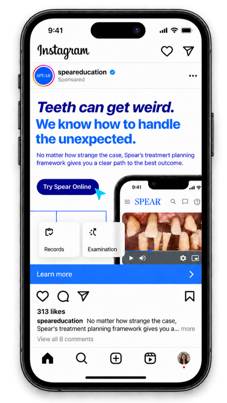
The launch campaign focused on the value of that experience: making it easier for doctors and their teams to find the education they needed, build confidence, track progress, and know where to start. Rather than selling education as an obligation, we focused on the moments practitioners face when they don’t immediately know the answer. Unexpected clinical scenarios became the entry point into a broader message about confidence, curiosity, and continued learning.
200%+ of sign-up and cart goals achieved in the first month
✦
200%+ of sign-up and cart goals achieved in the first month ✦

Making one brand work everywhere
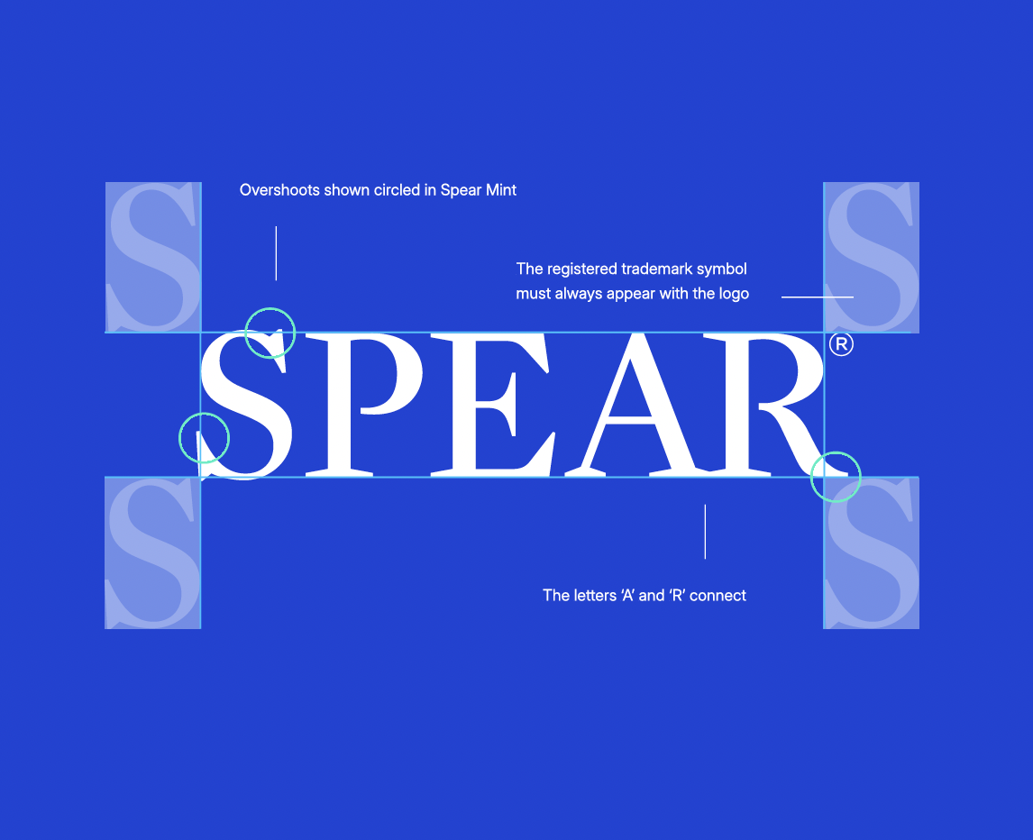
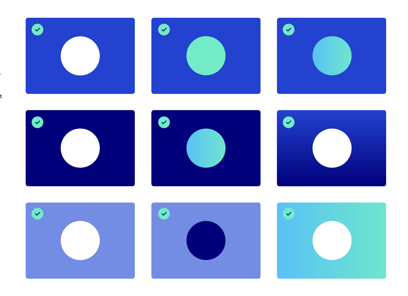
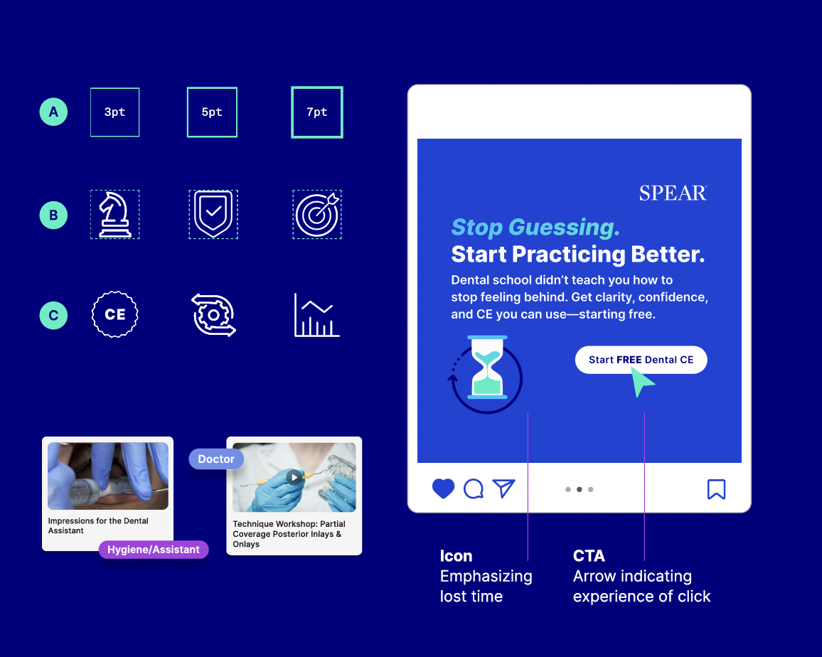
As Spear’s product ecosystem grew, so did the number of teams, partners, and touchpoints representing the brand. I helped build the standards and systems that gave internal teams and external partners enough structure to stay consistent without making the work feel rigid.

Turning values into a shared way of working
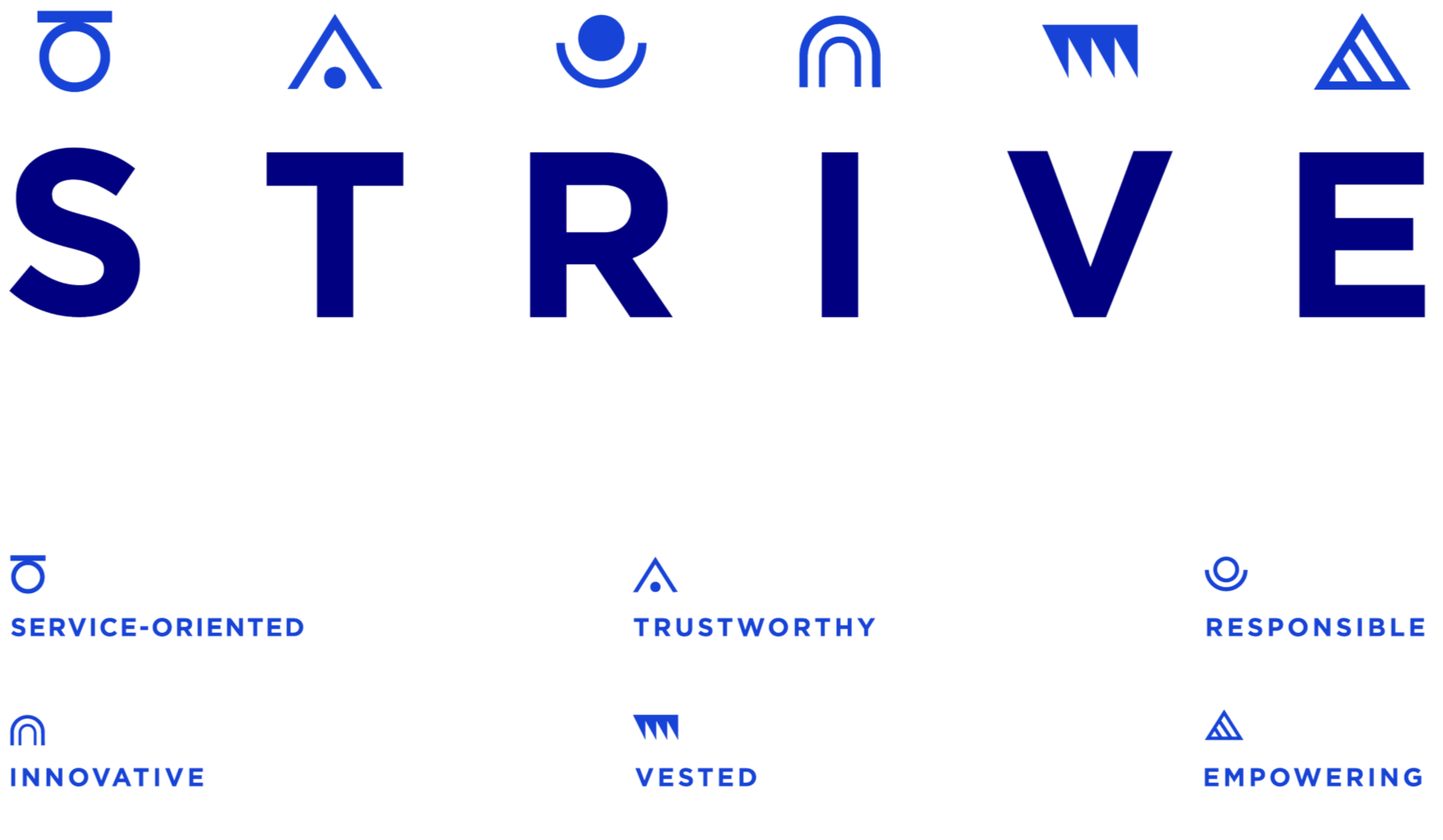
STRIVE translated Spear’s values into a clear internal framework employees could understand, remember and use. The system organized six shared behaviors into a cohesive visual language, creating a consistent reference point for collaboration, decision-making and customer experience across the organization.
Bringing the Spear community together
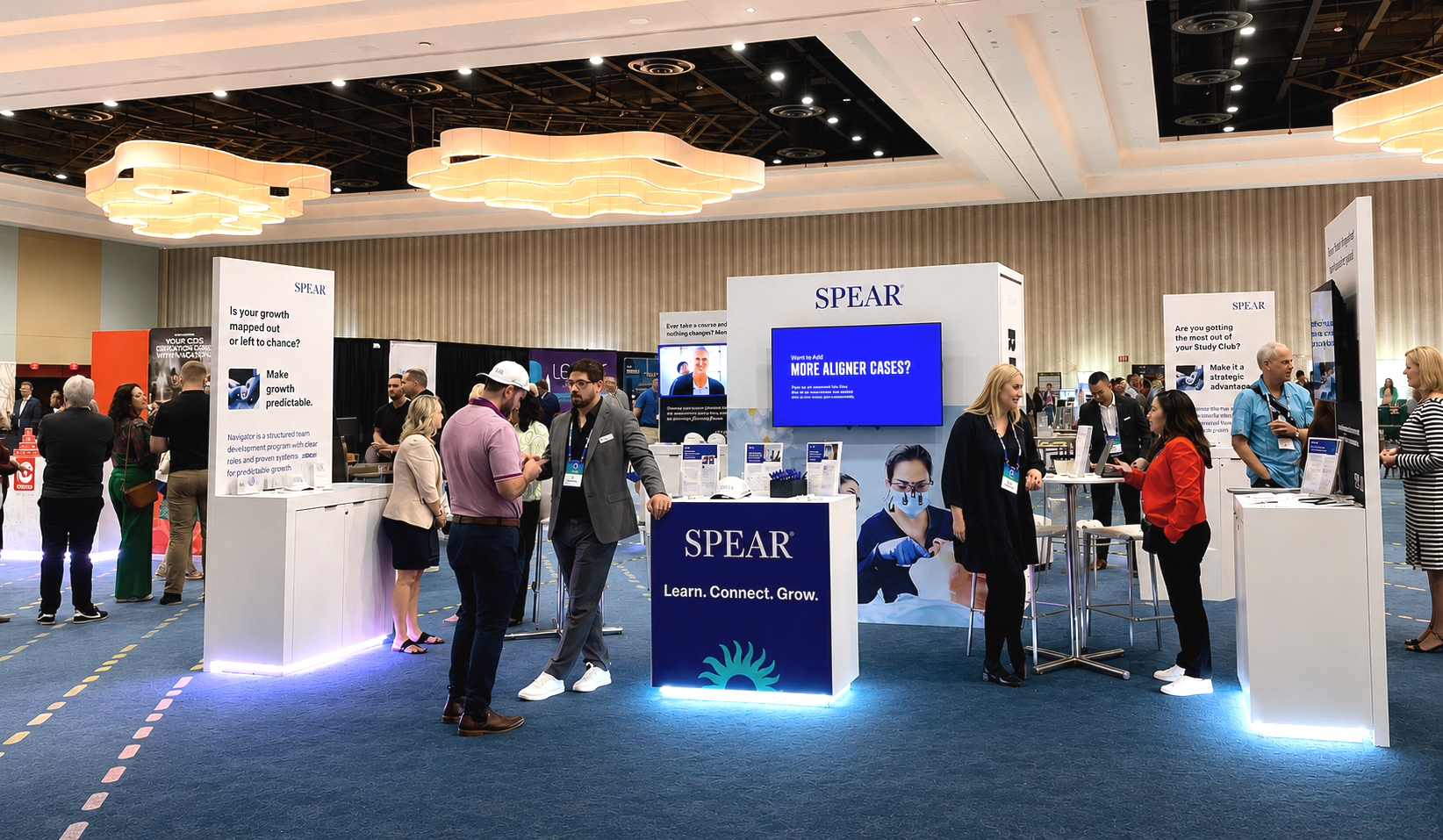
From campaign promotion and environmental graphics to collateral and attendee touchpoints, Spear Summit extended the brand into a live experience built around learning, connection and growth. I helped shape a cohesive system that carried from pre-event marketing through the physical space, creating a consistent experience before, during and after the event.
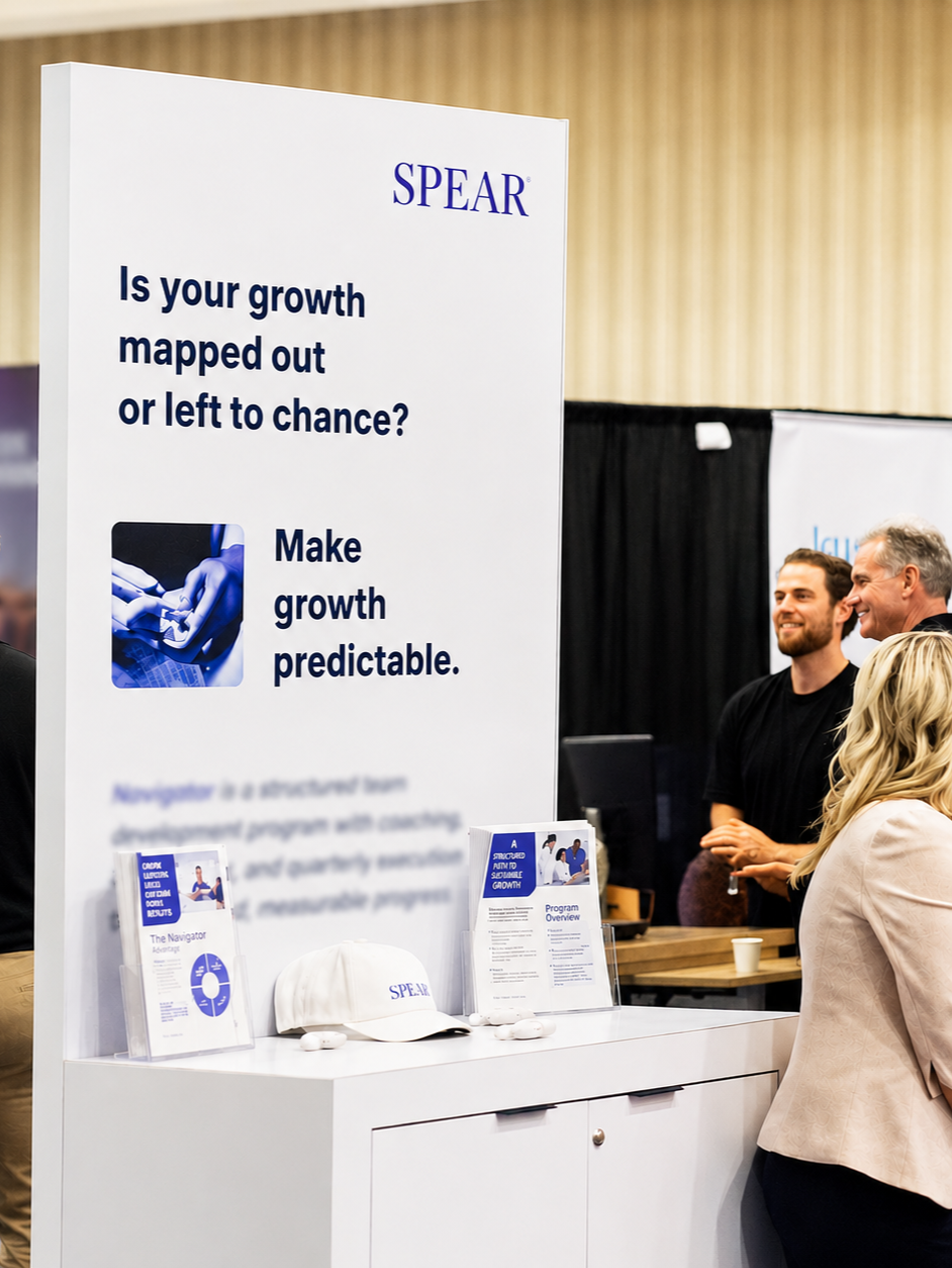
20% increase in attendee engagement
✦
20% increase in attendee engagement ✦
Creative direction for a social campaign video promoting Spear Summit, produced and edited in collaboration with the Spear Video Team.
Change at Spear was rarely fast or linear. Priorities shifted, leadership changed, and the brand kept evolving alongside the business. My role was often to hold onto the common thread: what felt unmistakably Spear, what needed to move forward, and what could flex without losing the whole. Progress happened piece by piece, but by the time I left, the brand was more connected, more contemporary, and better equipped to grow.
Her ability to transform requirements into innovative concepts that resonate with audiences is exceptional. With a deep understanding of both EdTech and complex dental topics, she created compelling visuals and copy that were instrumental to our success. Equally important, her empathy, leadership, and collaborative spirit made her a joy to work with.”
— Ashleigh Stanford, VP of Marketing, Spear Education
“Working with Stephanie was an extraordinary experience
that consistently exceeded expectations.
Keep exploring
-
![]()
Cipher 10 Jeans
-
![Students walking down colorful stairs]()
Campus Philly
-
![Miami City Ballet dancers]()
Miami City Ballet
-
![]()
Love the Cook